Understanding the Inbranded email builder

Mojola
Last Update há 4 anos
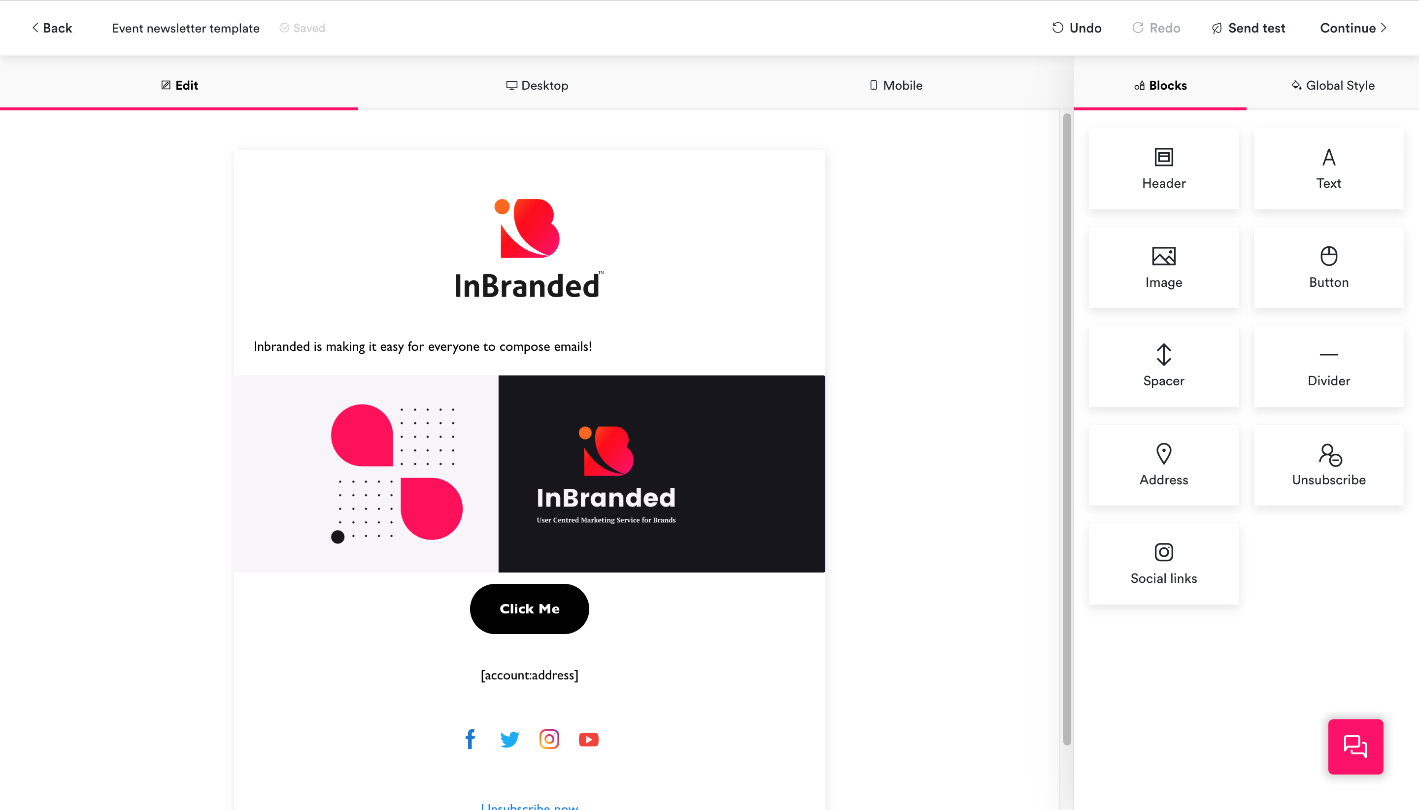
The layout of the builder is divided into 4 areas:
- The topbar
- The block preference panel
- The design area
- Floating controls
The top bar is located at the top of the builder, it contains the following
- The back button: For returning you to the previous page
- The title: For displaying and editing the email title
- The save status indicator: For displaying the saved status of the email ie is the email saved, currently being saved or unsaved?
- The undo and redo button: For undoing and redoing changes in the email.
- The send test button: For sending a test email to the desired email.
- The continue button: For publishing the email in a campaign/workflow.
The block preference panel is located at the right side of the builder interface, it contains options for customizing the look and feel of blocks in the email. The content of the components preference panel changes depending on the block in focus and displays the blocks and style preferences when no block is in focus.
The design area
The design area is located at the left side of the builder interface, it renders a preview of the emails and contains controls for making changes to the email.
These are controls that float in the builder interface.
- Chat control: For starting a chat session with a member of the Inbranded team when support is needed.