Understanding Inbranded design builder - Components and Layers.

Tomiwa Babatunde Jerimiah
Last Update 4 years ago
The Inbranded design-builder is where designs are prepped to be used either in a campaign, batch job or workflow.
- The topbar
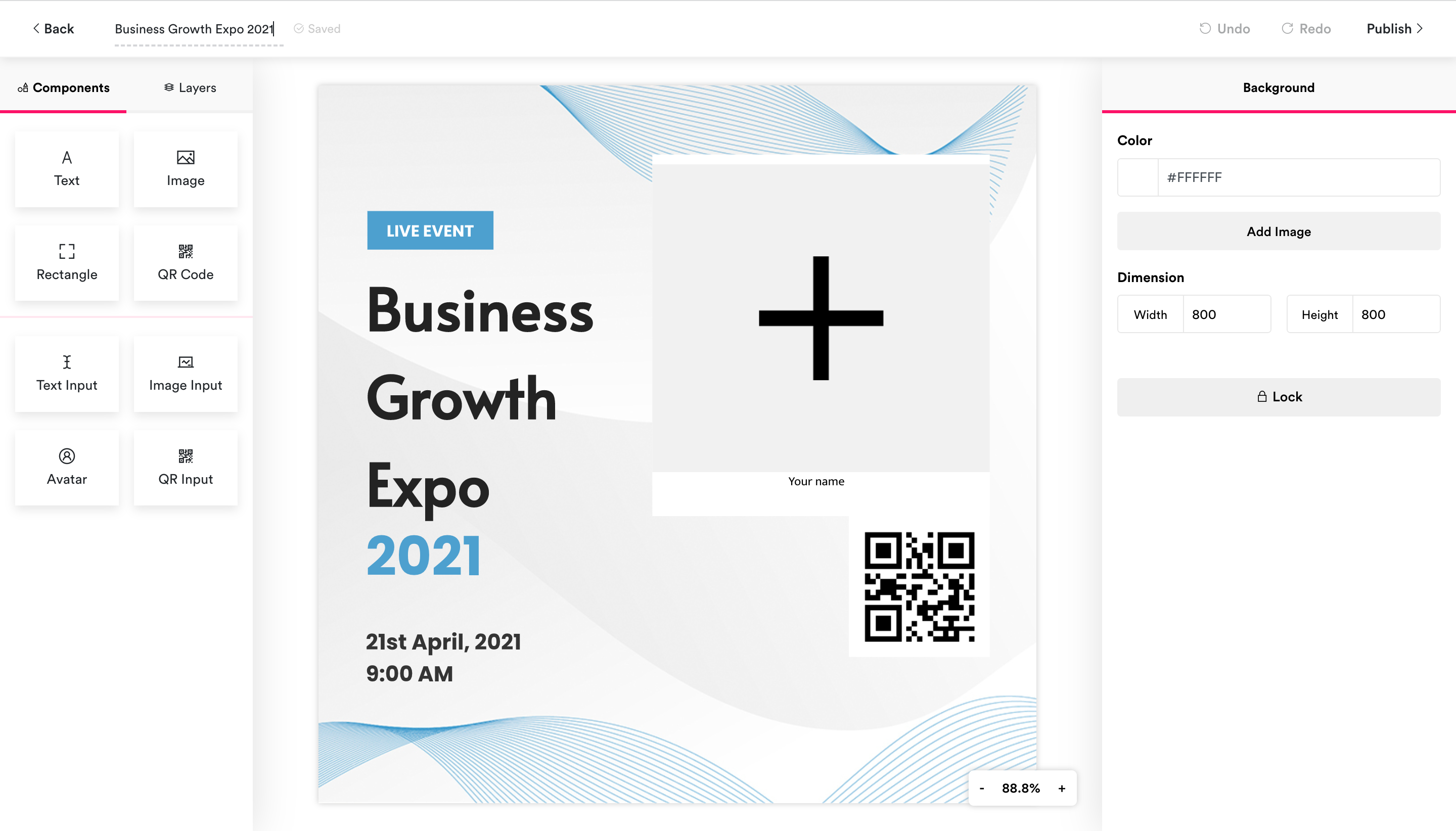
- The components and layers panel
- The component preference panel
- The design area
- Floating controls
- The back button: For returning you to the previous page
- The design title: For displaying and editing the design title
- The save status indicator: For displaying the saved status of the design ie is the design saved, currently being saved or unsaved?
- The undo and redo button: For undoing and redoing changes in the design.
- The publish button: For publishing the design in a campaign/batch job/workflow.
Components form the building blocks of a design. In Inbranded, a design is generated by layering multiple components in a design and flattening them into the final design. There are two types of components:
- Regular components: These are components that are rendered in the design-builder as they would in the final design. These are text, image, rectangle and QR Code.
- Input components: These are components that represent placeholders in the design phase and would be replaced/updated when the final design is created. These are text input, image input, avatar and QR input. The final data(text, image, QR code data) is made available through the campaign input, batch job data or workflow data.
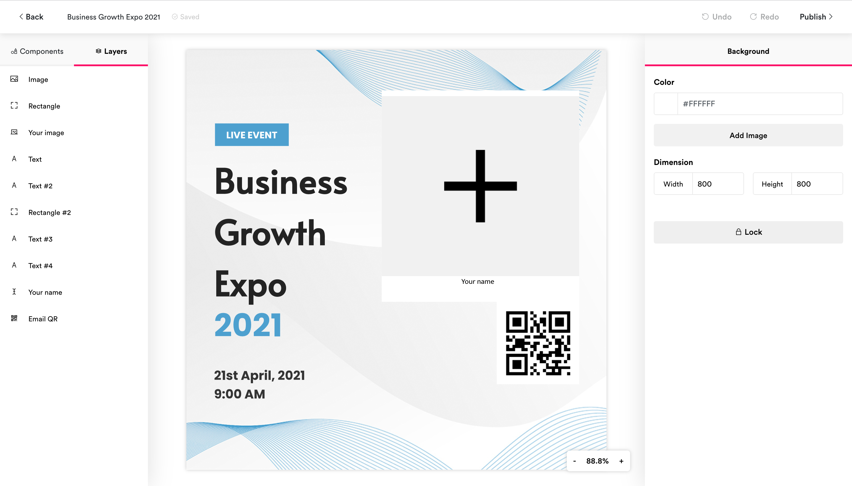
The components preference panel
The components preference panel is located at the right side of the design builder interface, it contains options for customizing the look and feel of components in the design. The content of the components preference panel changes depending on the component in focus, and displays the background preferences when no component is in focus.
The design area is located right at the center of the design builder interface, it renders a preview of the design and contains controls for resizing and repositioning the components in the design.
These are controls that float in the design builder interface. There are two floating controls:
- Zoom control: For zooming in and out of the design
- Chat control: For starting a chat session with a member of the Inbranded team when support is needed.